请问有什么可以帮助您?

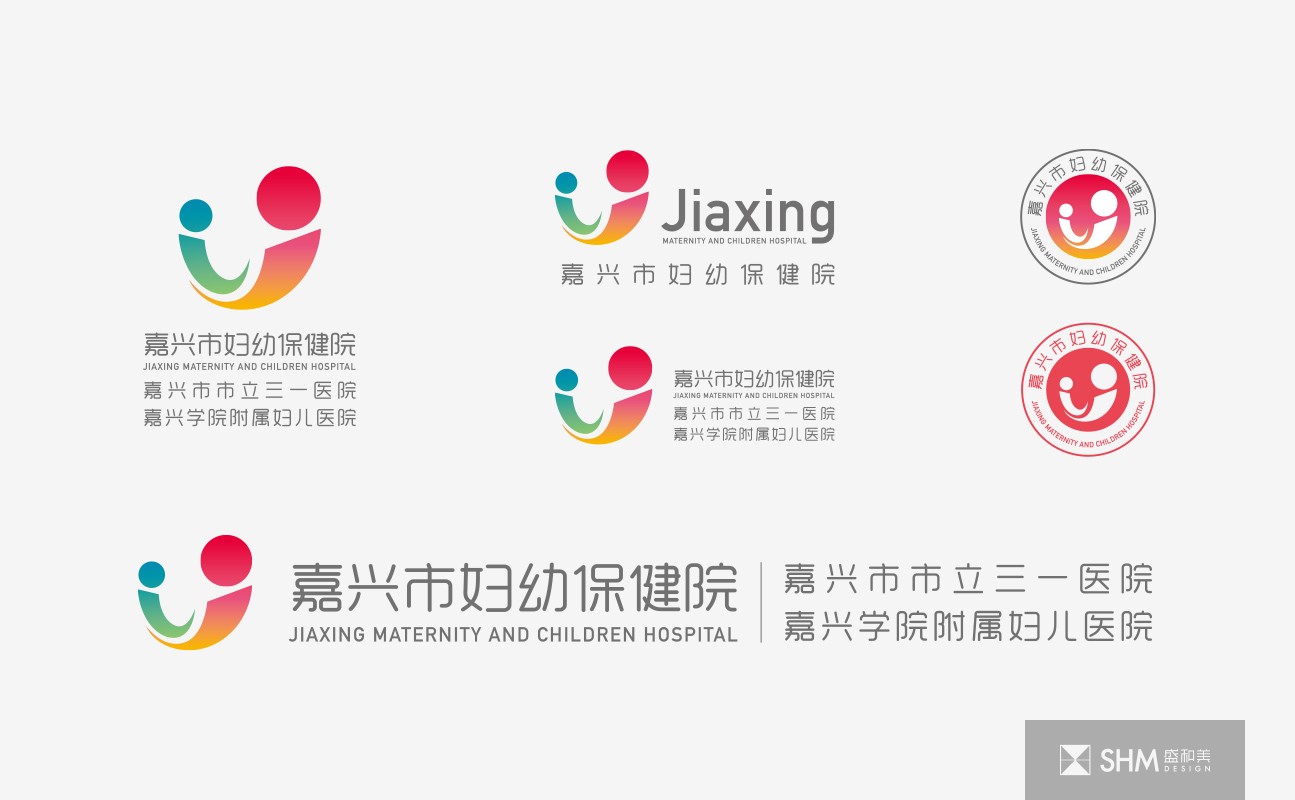
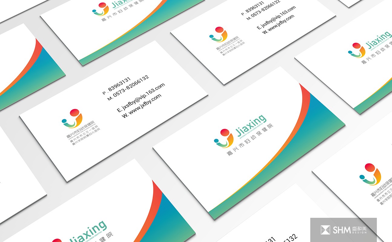
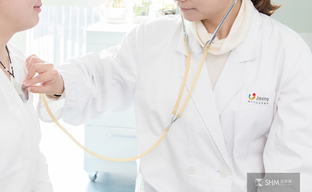
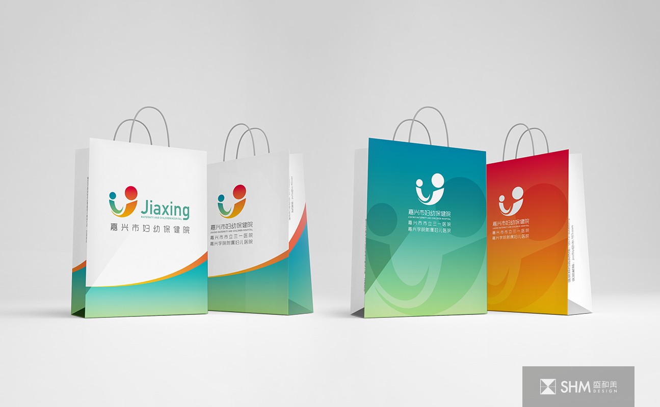
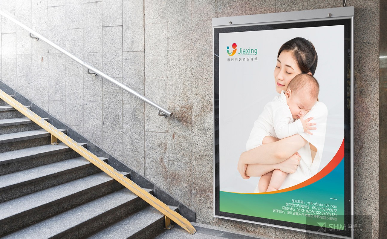
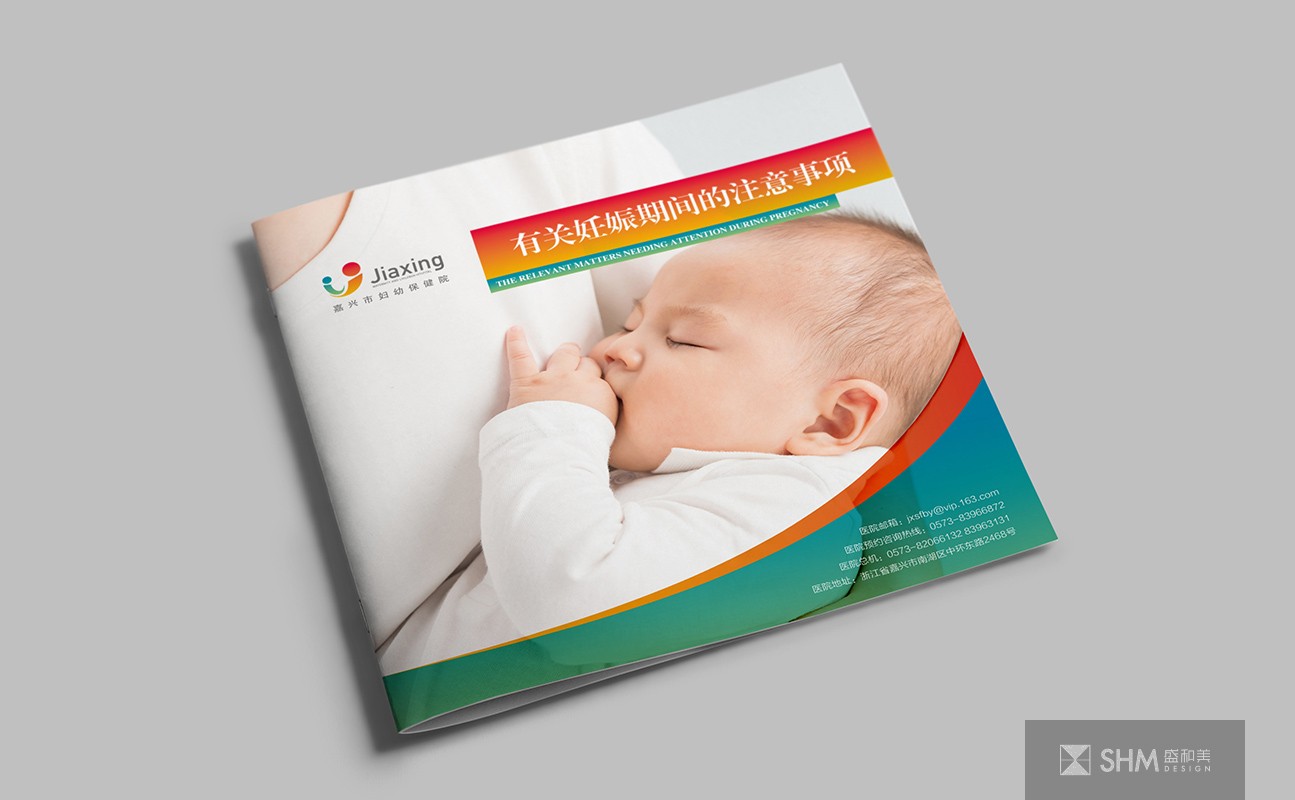
嘉兴妇幼保健院
Jiaxing Maternal and Child Health Hospital
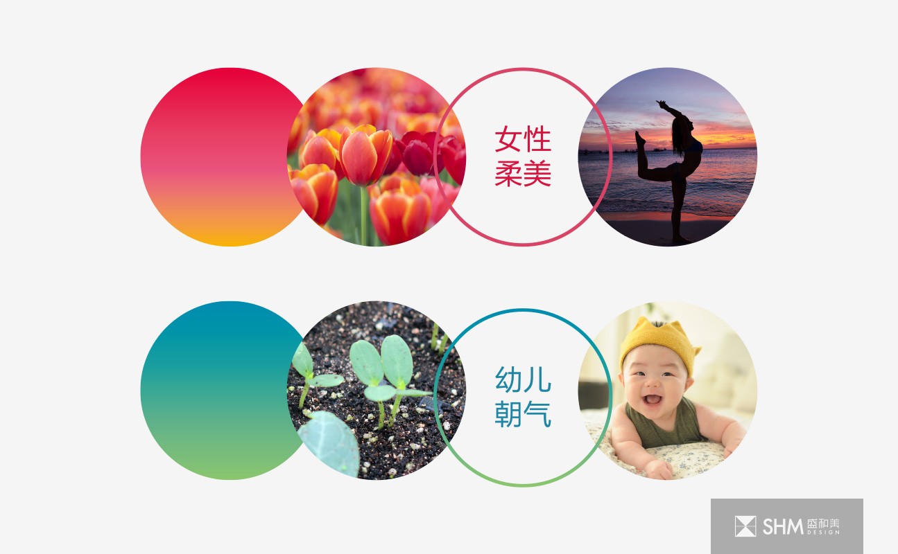
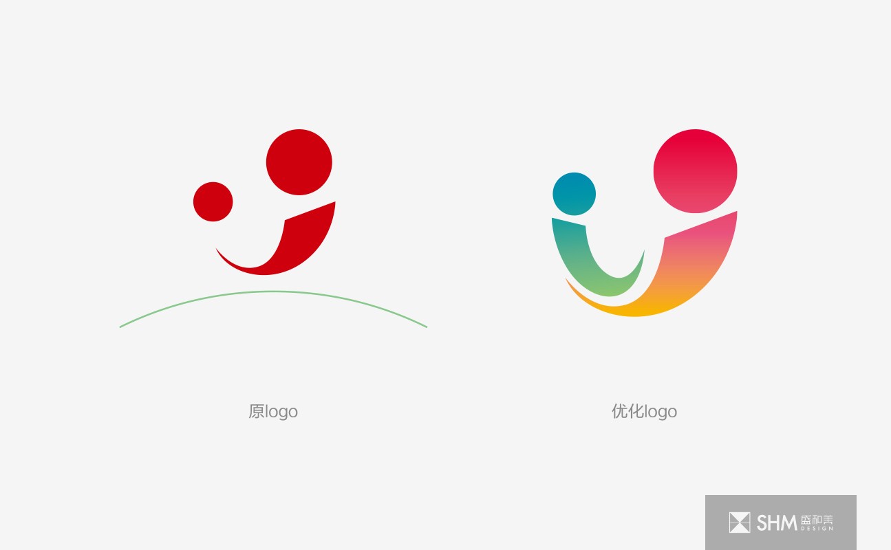
标志的优化融合了女性的柔美与幼儿的朝气,标志整体为圆形,代表安全与圆满,幼儿躺在女性怀中,展现着母亲的关怀保护,标志整体为圆形,代表安全与圆满,寓意院方将秉承“健康至上、务实求精、勤奋合力、科技兴院”的精神,开拓进取,积极推进管理创新,重视人文理念,强化专科建设,打造妇幼品牌;从破土而出的幼苗与花朵的渐变色彩中提取得到冷暖渐变色,达到了温馨安宁的视觉效果。
The optimization of the logo integrates the softness of women and the vitality of children. The logo is round as a whole, representing safety and completeness. Children lie in the arms of women, showing their mother's care and protection. The logo is round as a whole, representing safety and completeness. It means that the hospital will adhere to the spirit of "health first, pragmatism and refinement, diligence and joint efforts, science and technology prosper the hospital", forge ahead, and actively promote management and innovation New, pay attention to the concept of humanity, strengthen the construction of specialty, and build the brand of women and children; extract the cool and warm gradual colors from the gradual colors of seedlings and flowers from the ground breaking, so as to achieve a warm and peaceful visual effect.
扫码关注盛和美公众平台