请问有什么可以帮助您?

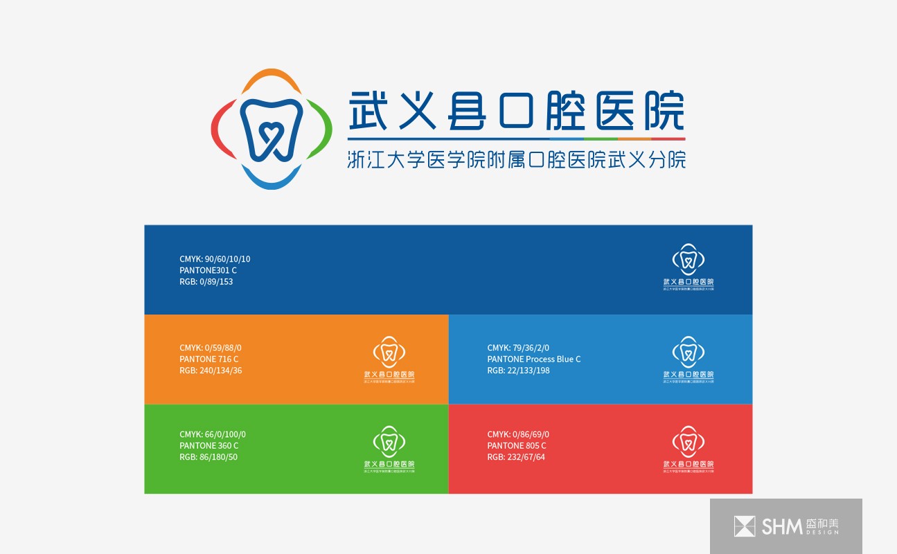
武义县口腔医院
Wuyi Oral Hospital
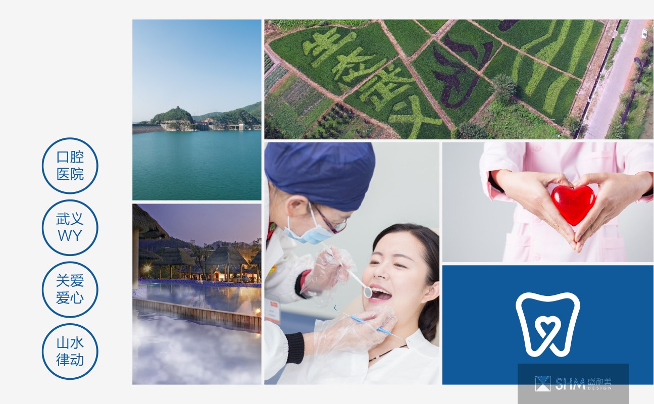
LOGO主体造型为牙齿的形状,上方略凹,有一种山的起伏律动感,也像水波纹荡漾,寓意人与自然的和谐共处。牙齿下方的线条交织形成一个心形,充分体现武义县口腔医院对就医患者的关心爱护之情,时刻为患者着想,以人为本。牙齿整体造型与心形中又蕴含着“武义”首字母“WY”,更贴合贴合武义县口腔医院的地理位置与专业定位。
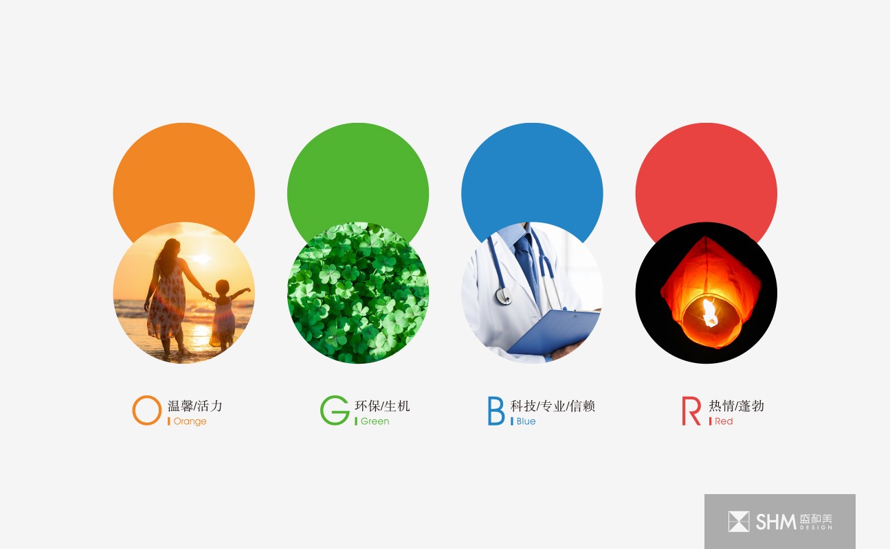
LOGO外形由四种颜色的飘带组成一个医院的十字形,在保留医院经典形象的同时融入现代手法与审美。红色代表热情、蓬勃,橙色代表温馨、活力,绿色代表环保、生机,蓝色代表科技、专业与信赖,寓意武义口腔医院会以专业的技术、周到的服务,为患者提供最舒适的就医环境与体验,让患者口腔能重新焕发健康的活力。
The main shape of the logo is the shape of teeth. The upper part is slightly concave. There is a kind of undulating movement of mountains, which is also like the ripple of water, implying the harmonious coexistence of human and nature. The lines under the teeth interweave to form a heart shape, fully reflecting the Wuyi County Dental Hospital's care and love for the patients, always for the patients, people-oriented. The overall shape and heart shape of teeth also contain the initial "WY" of "Wuyi", which is more suitable for the geographical location and professional positioning of Wuyi dental hospital.
The logo shape is composed of four colors of streamers to form a hospital cross, which integrates modern techniques and aesthetics while retaining the classic image of the hospital. Red represents enthusiasm and vitality, orange represents warmth and vitality, green represents environmental protection and vitality, and blue represents technology, profession and trust. It means Wuyi dental hospital will provide the most comfortable medical environment and experience for patients with professional technology and thoughtful service, so that patients' oral cavity can be rejuvenated with healthy vitality.

扫码关注盛和美公众平台